Aim Designs
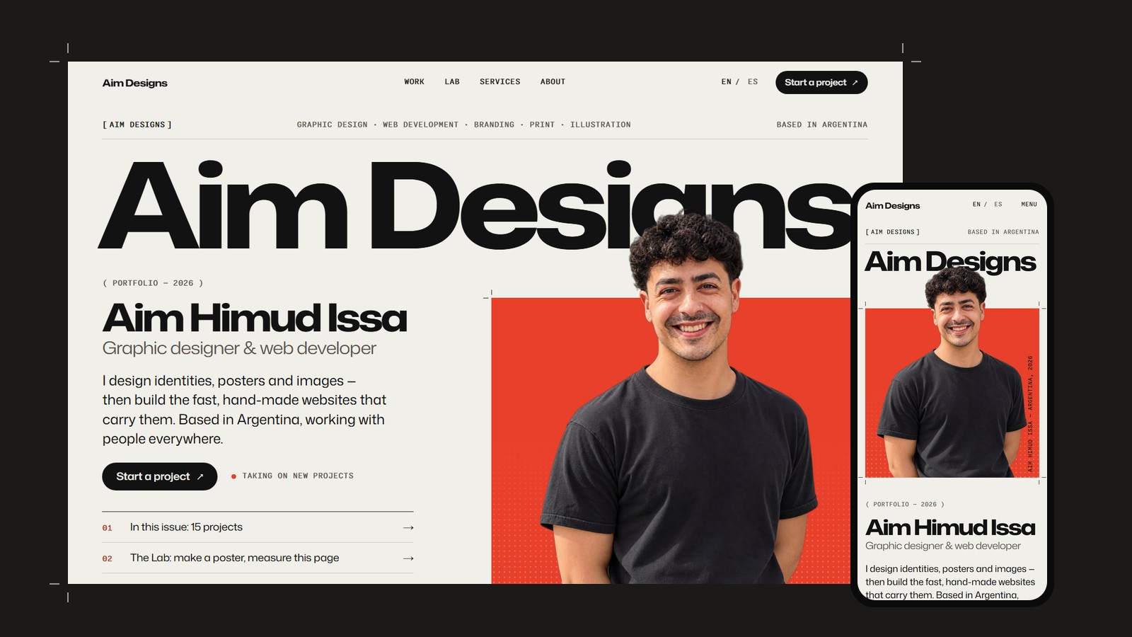
The identity and website you’re looking at — designed and built from scratch.
The brief
My own studio needed a home that does what I sell: clear, confident graphic design and a website that is fast, accessible and unmistakably mine — no template, no page builder.
The identity
The design language comes from the print shop. Crop marks frame every image like a press proof, captions are set as slug lines, a CMYK color bar signs the footer, and the cover portrait prints in cyan, magenta and yellow plates that slide into register. One spot color — vermilion — sits on warm, uncoated-paper tones.
#F1EFE9
#121212
#E8402A
#57544D
#E7E4DB
AaMona Sans — Expanded 760
Headlines
AaMona Sans — Expanded 330
Section titles
AaMona Sans — Normal 420
Reading
AaMonaspace Neon
Labels & captions
Type is a single family, Mona Sans, used across its width axis: expanded and heavy for headlines, expanded and light for section titles, normal for reading. Monaspace Neon handles the catalogue labels.
The build
The site is built with Astro and ships no framework runtime to the browser. Projects are Markdown files, so adding one is a single file and an image. Fonts are subset to the characters actually used, and the headline face is cut down to an 18 KB static file so it paints first. Images are served as AVIF and WebP in responsive sizes, pages morph into each other with native View Transitions, the whole site is available in English and Spanish, and every interaction works with a keyboard and respects reduced-motion settings.
The result
Lighthouse scores of 100 for performance, accessibility, best practices and SEO on desktop, with no layout shift as the page loads. The Lab on the home page measures it again, live, in your own browser.